Giving young footballers access to Professional insights
Helping Catapult sports launch their first direct to consumer product. allowing amateur footballers to access their data & insights from Professional sports scientists.
Auditing the initial designs
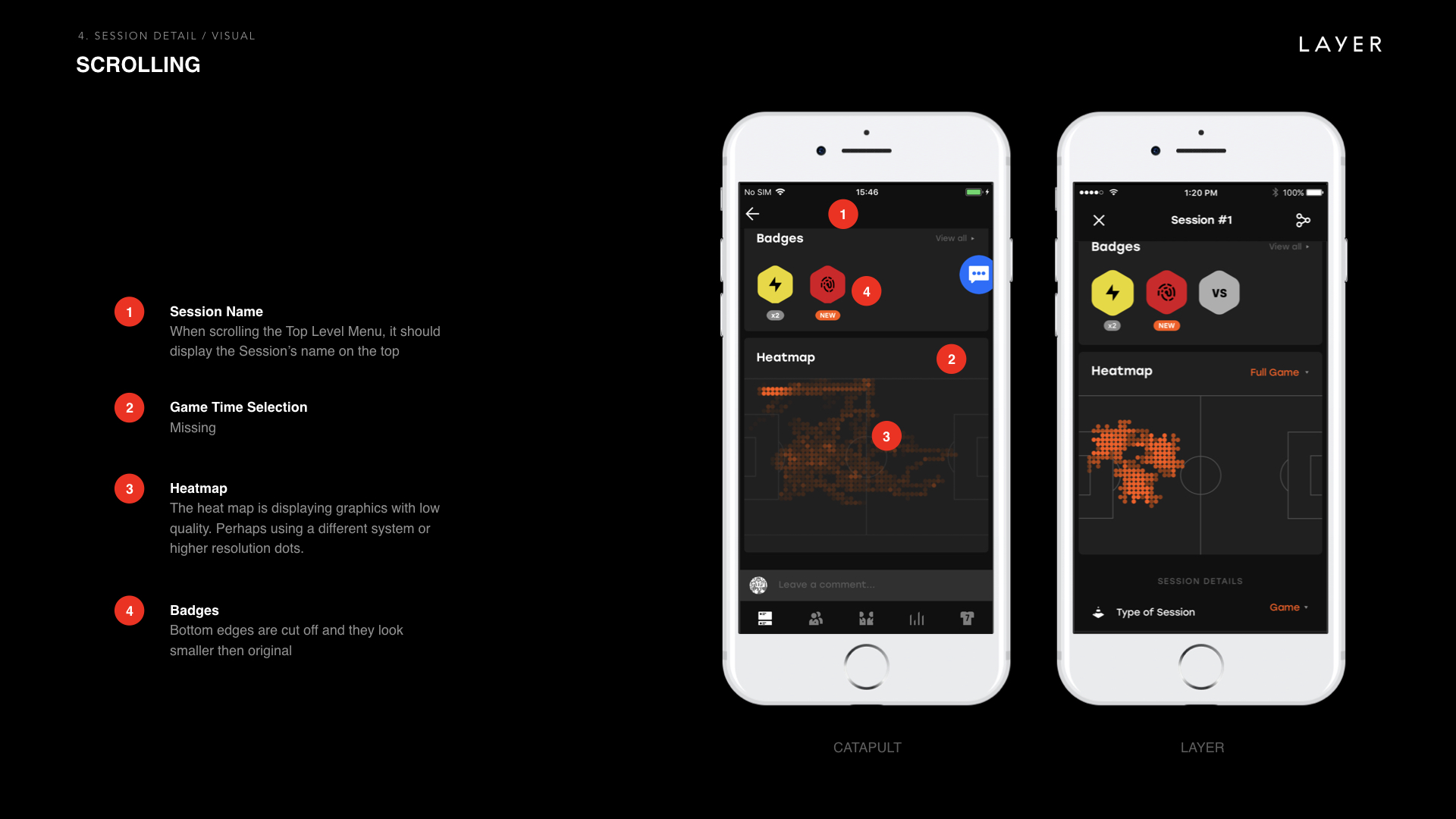
My first task on this project was to audit the design and UX that was previously created by another agency. I was given a deck with all of the screens and interaction examples, I went through this and noted possible problems and areas to focus for the upcoming redesign.
This annotations in these screenshots are not mine, they were created by the previous agency.
Auditing existing products
Catapult sports had previously purchased a company called PlayerTek, I worked with the existing team to learn about their functionality, previous challenges and learnings to benefit the upcoming launch of PLAYR.
Sketching & functional flows
Through-out the project I would sketch flows and screens to work up ideas and solutions for each section of the app.
I would work closely with the designers, developers and senior stakeholders to document and refine these solutions, the next task would be to start wireframing screens and digitising the flows.
Wireframes & flows
The main way we communicated between the design, development and firmware teams was to create detailed functional flows that I would initially create using wireframes and then later update and amend when designs became available.
These flows would document how the user interacts with the app & product, firmware connections and tech limitations.
We would use these flows as discussion points and to locate potential gaps between design and tech.
Prototyping interactions
As we progressed with the project and the flows were finalised, I would work closely with the designer to start to prototype key journeys and interactions to advise developers how we would like users to interact with the app and product.
A prototype created to show the animation for syncing a session and adding details.
A video created to show how the calendar should work and how the user can navigate to previous sessions.


