Bringing back to 90’s for Marc Jacobs
Launching Heaven, the Marc Jacobs brand aiming to bring back grunge and the New York club scene through its clothing.
Recreating pages based on existing modules
As the Heaven site would be accessible from the Marc Jacobs website we started to build page frameworks based on existing modules created in the previous Marc Jacobs project.
The idea here was to review modules available to us and start to create narratives for key pages that would overlap with the main Marc Jacobs site.
The Homepage you see to the right was based on an initial brief of a re-skin.
Detailing how Heaven can have its own presence and personality within marcjacobs.com
This site had to sit under the Marc Jacobs sitemap but the client wanted Heaven to have its own personality and to make it feel different to the rest of the site.
I came up with a few options for the site structure and created these flows to present to the wider team and clients.
Option for how Heaven could sit within the Marc Jacob site architecture whilst still having its own presence.
Second option for the Heaven site flow.
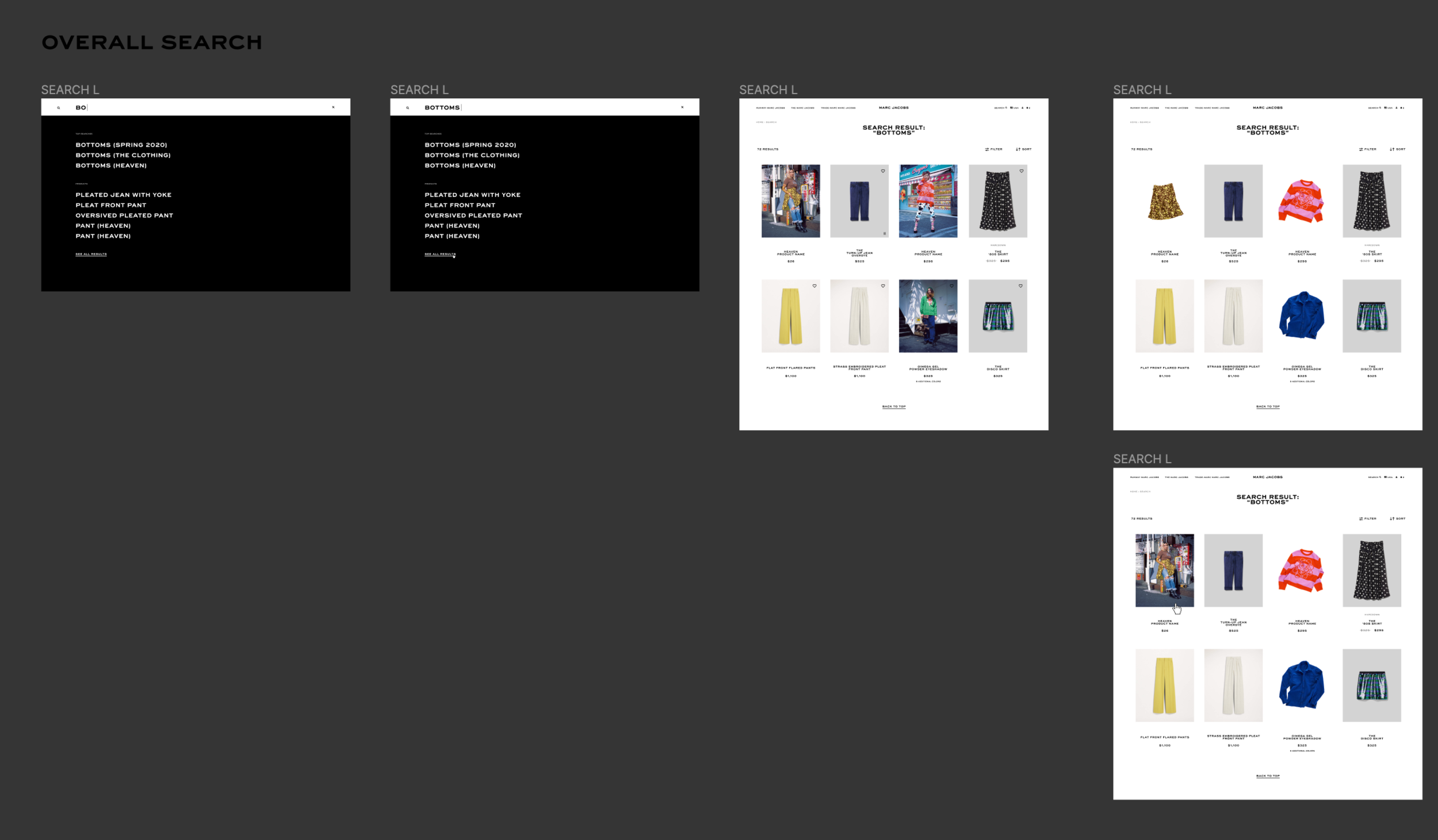
Defining how Heaven fits into existing Search mechanics.
One of my tasks on this project was to show how Heaven products and search terms would be applied to the existing search.
I created screen and flows that could go into a Keynote to present options back to the client.
Screen flows created to present options for the Search mechanic within marcjacobs.com
Screens displaying variants of how Heaven products would be shown next to THE and Runway Marc Jacobs products.
Working with the team to push page designs.
Working closely with the Creative Director and other designer to create some possible designs, working in Figma collaboratively to bounce ideas and tweak whilst working remotely.
Documenting the site for the development team.
Working with a third party off-shore development team meant that when I created the handoff document we had to make sure we collated all the designs, added measurements and annotations so we could handoff and deliver to the dev team to start their sprints.
I created this as a separate Figma that could be accessed by the client and dev team.
Screenshot detailing the breakpoints for the final PDP designs from the development handoff.
Screenshot of the development handoff I created showing the measurement and paddings redlining.
Breaking out the components for the PLP product cards and adding annotations for the third party development team.


